 |  |
|  | |||||||


| Probability and Statistics By Sir Dr. Asghar |
 |
| | Thread Tools | Search this Thread | Rating:  | Display Modes |
|
#1
 08-03-2009, 02:08 PM
| ||||||||||||||||||||||||||||||||||||||||||||||||||||
| ||||||||||||||||||||||||||||||||||||||||||||||||||||
|
or the histograms' usage in digital image processing, see Image histogram and Color histogram. 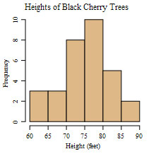 An example histogram of the heights of 31 Black Cherry trees. In statistics, a histogram is a graphical display of tabulated frequencies, shown as bars. It shows what proportion of cases fall into each of several categories. The categories are usually specified as non-overlapping intervals of some variable. The categories (bars) must be adjacent. The intervals (or bands) should ideally be of the same size [1]. Histograms are used to plot density. The total area of a histogram always equals 1. If the length of the intervals on the x-axis are all 1, then a histogram is identical to a relative frequency plot. The word histogram is derived from the Greek histos 'anything set upright' (as the masts of a ship, the bar of a loom, or the vertical bars of a histogram); and gramma 'drawing, record, writing'. The histogram is one of the seven basic tools of quality control, which also include the Pareto chart, check sheet, control chart, cause-and-effect diagram, flowchart, and scatter diagram. A generalization of the histogram is kernel smoothing techniques. This will construct a very smooth probability density function from the supplied data.
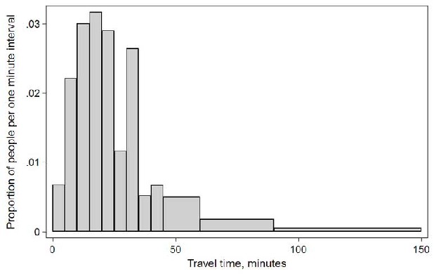 In other words a histogram represents a frequency distribution by means of rectangles whose widths represent class intervals and whose areas are proportional to the corresponding frequencies. They only place the bars together to make it easier to compare data. See some Useful examples for the hostograms 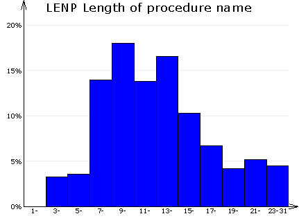 Histogram of column 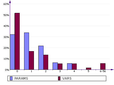 Compare histograms 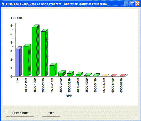 Operating Statistics Histogram 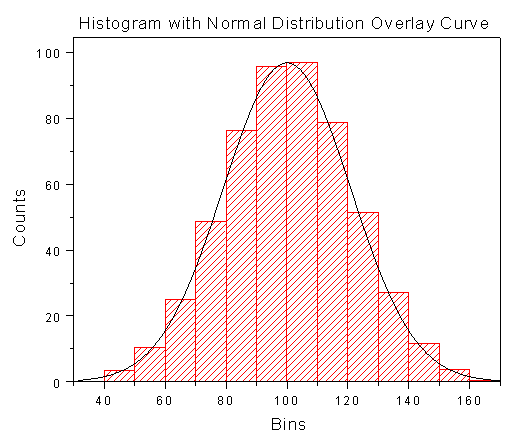 Histogram with overlay Curve
__________________ (¯`v´¯) `*.¸.*` ¸.*´¸.*´¨) ¸.*´¨) (¸.*´ (¸.Bzu Forum   Don't cry because it's over, smile because it happened Don't cry because it's over, smile because it happened   |

 .BZU.
.BZU.


|
| Tags |
| charts, examples, histogram, simple |
« Previous Thread
|
Next Thread »
| Currently Active Users Viewing This Thread: 1 (0 members and 1 guests) | |
 Linear Mode

| |

 Similar Threads
 | ||||
| Thread | Thread Starter | Forum | Replies | Last Post |
| DC Circuits with Practical Examples. | bonfire | Electrical Circuits | 0 | 16-04-2011 11:59 PM |
| Interesting Charts... | Raheel | Designed Pictures | 0 | 18-08-2010 02:53 PM |
| Impressive Examples of Reflection Photography | .BZU. | Funniest Pictures | 0 | 11-04-2010 10:07 PM |
| 36 Brilliant Examples of Photo Manipulation Art | momna gull | Designed Pictures | 1 | 12-01-2010 06:13 PM |
| Top Charts, Play and listen songs | montecristo | English Songs | 0 | 07-01-2010 03:40 PM |
Almuslimeen.info | BZU Multan | Dedicated server hosting
Note: All trademarks and copyrights held by respective owners. We will take action against any copyright violation if it is proved to us.
All times are GMT +5. The time now is 01:25 AM.
Powered by vBulletin® Version 3.8.2
Copyright ©2000 - 2026, Jelsoft Enterprises Ltd.
Copyright ©2000 - 2026, Jelsoft Enterprises Ltd.